
Tricuro is a care provider born from a first: three councils coming together in one joint venture. It employs more than 1,500 staff and supports older people, people with physical and learning disabilities, people with mental health needs, and their carers and families. It needed one identity everyone could stand behind.
Client
- Tricuro
Sector
- Charity & Community
Services
- Strategy
- Brand
Three stakeholders, one brand.
A politically forward-thinking project came with plenty of politics, and three key stakeholders who each wanted ownership. We focused on the people involved rather than the politics, listening to each of them and giving every stakeholder a real share in the outcome.
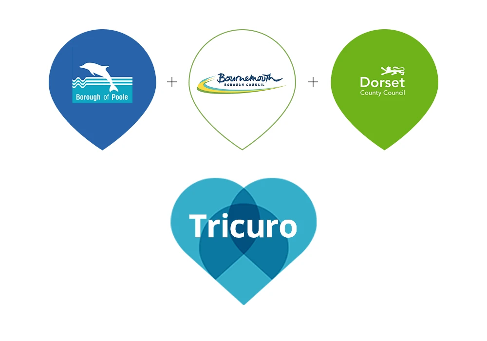

Three pins that make a heart.
At the heart of the brand are shared values: trust, care and togetherness. The Tri-pin mark brings three location pins together to form a heart, capturing the places Tricuro serves, the three councils that created it and the caring nature of the work.
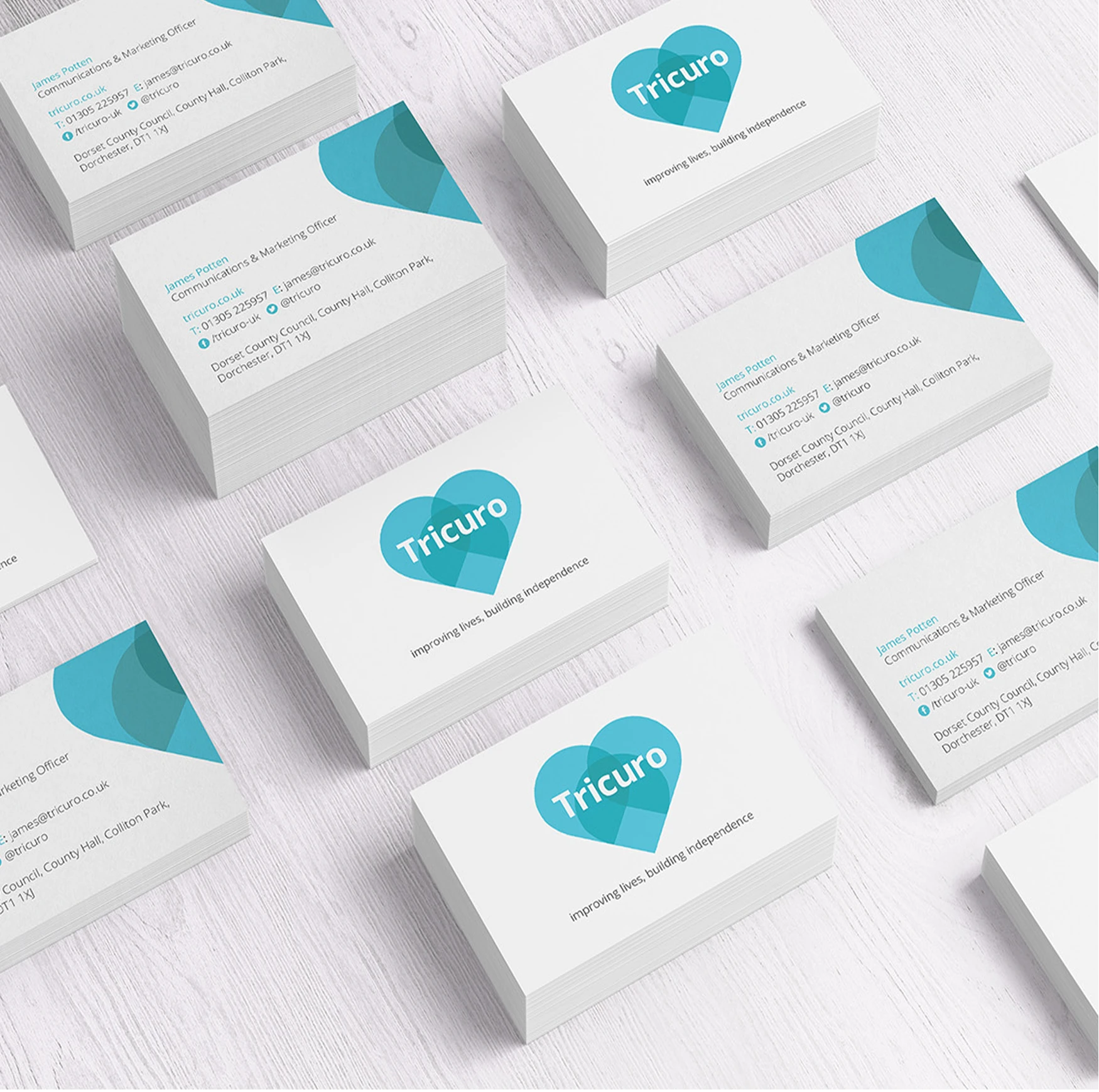

Committees can build thoroughbreds.
Committee-led projects often produce a camel. Here, a clear process kept everyone engaged and delivered a simple, warm identity that elevates the whole organisation and helps Tricuro connect with the communities it serves.
Ready for a brand that
matches your ambition?
See exactly where your brand stands against your competitors, or start your own project with a clarity call.