Eight Wealth Management is a partner practice of St. James’s Place. Its old logo hid the all-important 8, so most people simply read it as Wealth Management. With ambitions to grow into Shanghai and Singapore, it needed a brand that was clear, distinctive and ready to travel.
Client
- Eight Wealth Management
Sector
- Finance & Tech
Services
- Brand
The power of the hidden 8.
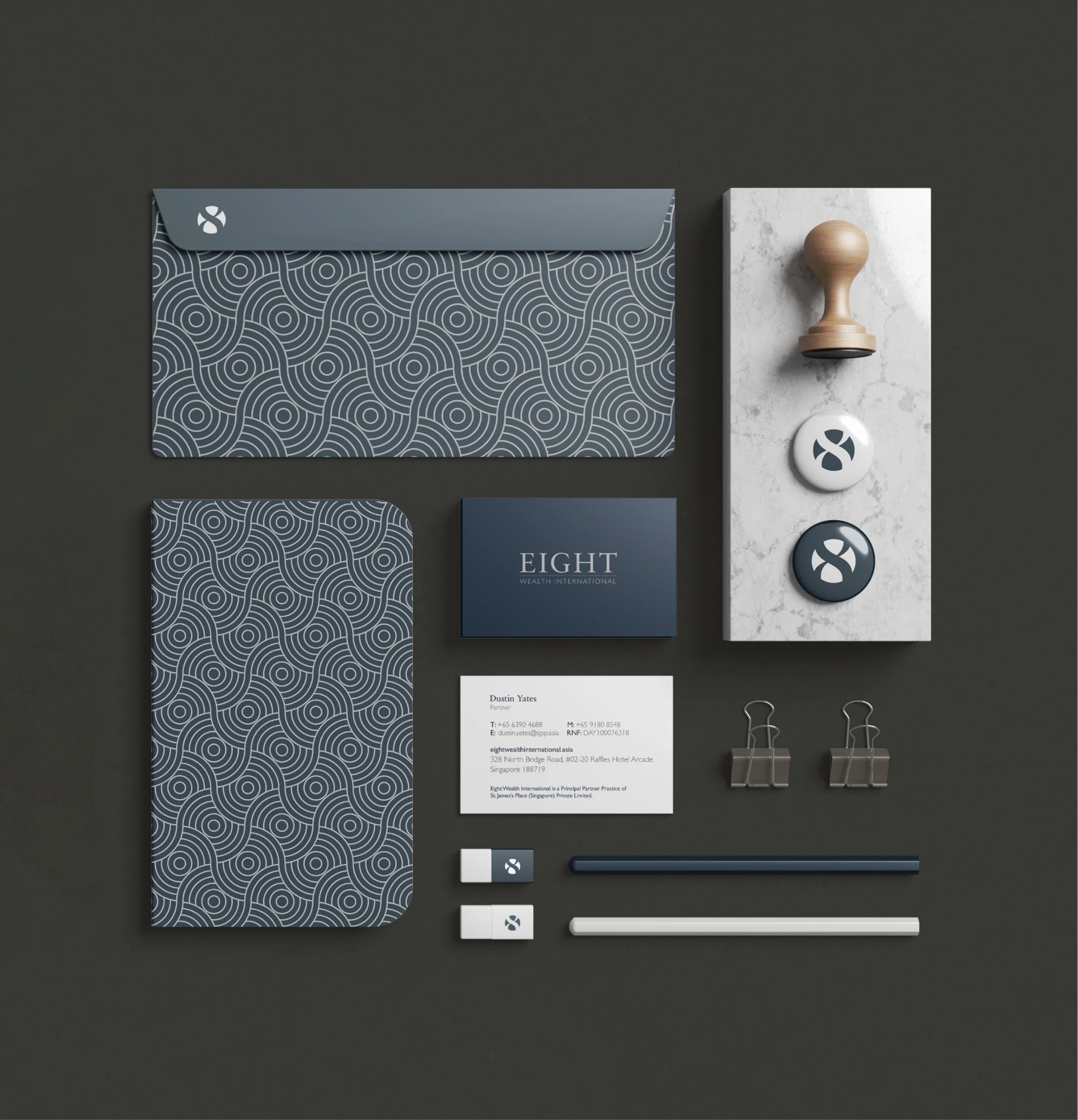
We kept the essence of the 8 but reworked it to be distinct and versatile, with a bespoke wordmark so the 8 can stand alone or sit within the name. The typeface blends the classic and the contemporary, reflecting deep expertise and an ambition to evolve.
- Bespoke wordmark and a standalone 8 symbol
- A palette led by mature blues
- Candid photography of the team and their offices
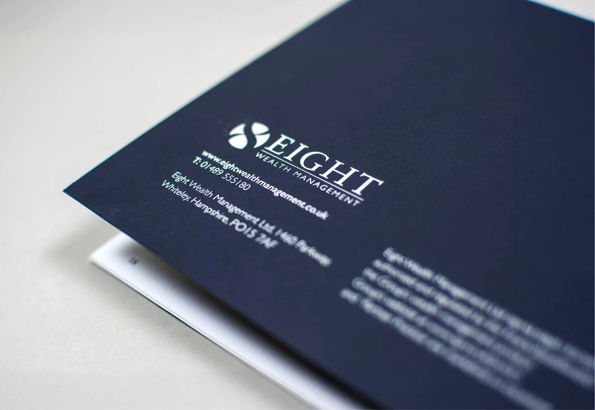
- Print brochures and a revamped website
See the services behind this project: Brand.
Where heritage meets ambition.
Mature blues project sophistication with approachable professionalism. Candid photography of the team and their modern offices carries the brand’s personality from print brochures to the revamped website.
8 goes global.
As Eight Wealth International expanded into Asia, the refreshed brand gave it a polished, universally appealing identity suited to a diverse clientele, built on timeless design delivered flawlessly.
Ready for a brand that
matches your ambition?
See exactly where your brand stands against your competitors, or start your own project with a clarity call.