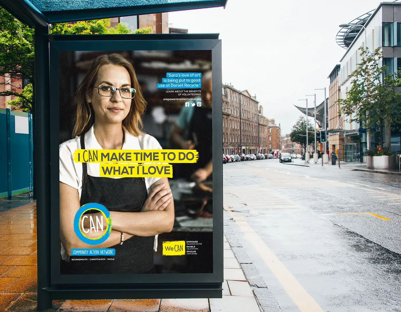
Community Action Network (CAN) connects charities, volunteers and communities to create positive change across Dorset. It needed far more than a logo: a brand that could unite very different audiences, inspire volunteers and partners, and grow with the organisation for years to come.
Client
- Community Action Network
Sector
- Charity & Community
Services
- Brand
- Content & Film
Built around two words: We CAN.
Community brands work when people feel they belong. We built the identity around one simple idea, We CAN, with bold type, expressive brushstroke graphics and a vibrant palette that feels optimistic, energetic and easy to approach.
- Brand identity and guidelines: typography, colour, imagery and application
- Everyday assets: stationery, presentation templates and email signatures
- Social media graphics and event materials, so the team could launch with confidence
See the services behind this project: Brand and Content & Film.
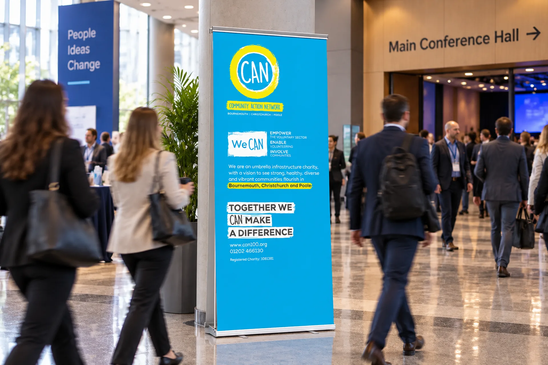

A brand that grew with the mission.
Launch was only the beginning. Campaigns like A Good Life encouraged volunteering and business engagement, brochures explained CAN’s role in the voluntary sector, and a family of sub-brands, from CAN Wellbeing Collaborative to Charities in the Spotlight, sat comfortably within the master brand. Promotional films, AGM presentations and social edits followed.
Seven years, and still evolving.
When CAN expanded beyond Bournemouth, Christchurch and Poole to the whole of Dorset, we refreshed the identity to match, updated the mission graphics and created anniversary branding for fifty years of community impact. What began as a branding project is now a creative partnership of more than seven years.
Ready for a brand that
matches your ambition?
See exactly where your brand stands against your competitors, or start your own project with a clarity call.